Denplan
Updated web style and new mobile app
Dental insurance provider
UX audit, UI design, UI kit, onboarding experience, mobile and web


About Denplan
Denplan is a dental insurance provider that offers flexible and affordable plans for individuals and businesses. Their corporate web system allows users to submit claims and view benefits. However, the current user interface suffers from usability and aesthetic issues that affect user satisfaction and effectiveness.
Problems
The main problems with the current user interface are:
It is confusing and inconsistent, leading to user errors and frustration.
It is outdated and unappealing, creating a negative impression of the brand and its quality.
It is not responsive or adaptive, resulting in poor user experience on different devices and screen sizes.
My role
As a UX/UI designer, I performed the following tasks to improve the user interface:
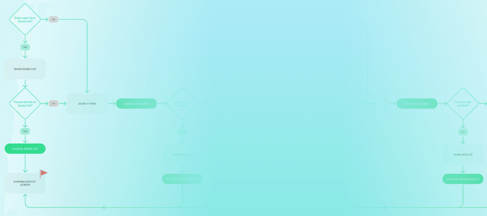
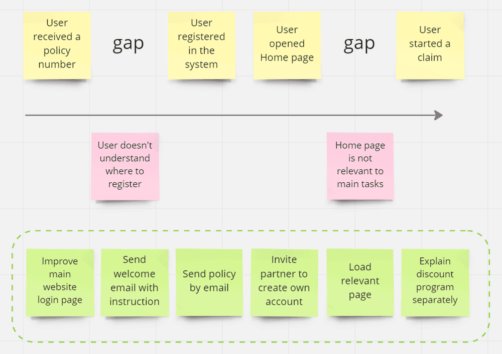
I conducted a heuristic evaluation and usability testing to identify the most critical usability issues and user needs.
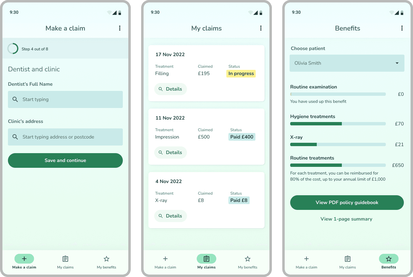
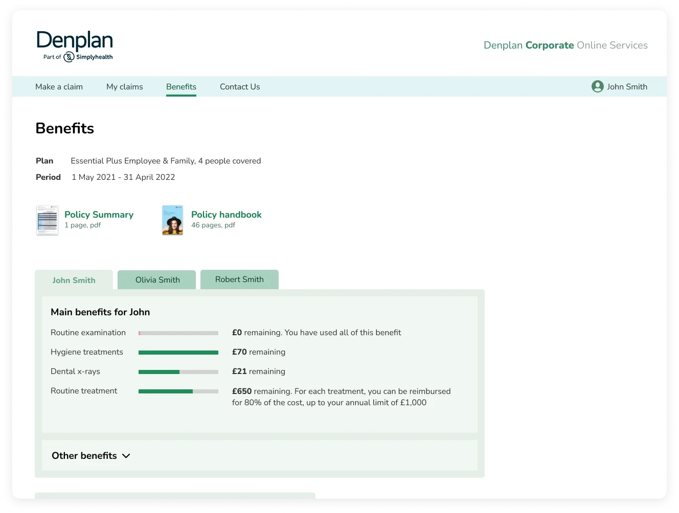
I redesigned the main screens for the web version and the mobile application, applying UX best practices and guidelines.
I created a UI kit for developers to ensure consistency and maintainability of the design.


Results
The redesigned user interface achieved the following results:
It reduced the time and effort required for users to add a dental claim by simplifying the form and providing clear feedback.
It reduced the number of errors and user uncertainty by eliminating ambiguity and improving navigation.
It enhanced the user experience for new users by providing an intuitive onboarding process and a clear value proposition.
It increased subjective user satisfaction by creating a visually appealing and engaging interface that reflects the brand identity and values.