MyTimeActive
Powerful booking experience even for new users
Fitness and wellbeing provider
Expert evaluation, usability testing, user flows, navigation, visual design

About MyTimeActive
MyTimeActive provides local leisure and fitness activities. It has 6 leisure centres and swimming pools and 11 golf courses.
The problem
It’s very difficult to understand how to book MyTimeActive activities online.
Whenever I opened their booking platform, I was stunned by an enormous list of the gym, soft play, swimming blocks, etc. It took time to realise that these were currently available sessions, not the activities themselves.
When I tried to use filters, the system reacted not as expected. I was asking myself “How is everything connected inside the platform? How is it supposed to work?” I just couldn’t create a model of the booking platform in my mind.
So, I gave up. I have used it for 3 years and still, the only reliable way to find the desirable activity is to look through the very long list of all available sessions of all activities. This happened not just to me. In my research, I interviewed and observed 7 people to get insights.
Self-initiated work
I need to admit that my design won’t be a perfect solution for the MyTimeActive business because it lacks something important – current technical constraints (because, well, I don’t work at MyTimeActive).
Why do I still want to continue? I am curious how it may look and work. I think that the new system model and object structure are partly independent of the implementation, and research insights can also be used with any implementation. So, the proposed design can be adapted to technical constraints, and the overall process will be faster and easier than starting from scratch.
Complexity is high
First, the system has completely different types of activities like group exercises (“classes”) with schedules and instructors, golf where users are not restricted by the scheduled time, family activities where participants need to add more people to the booking, and other different activities. It’s overwhelming.
The second, there is no single best scenario. In the group exercises booking a user may start by choosing her favourite classes, or by choosing a category or choosing a date. It varies from user to user. The system should be flexible, powerful, and relatively easy to use. My goal was to find the balance between flexibility and simplicity and don’t forget about appealing design.
Solution
Appropriate navigation, easy scenario switching and personalisation
Finding the best navigation model
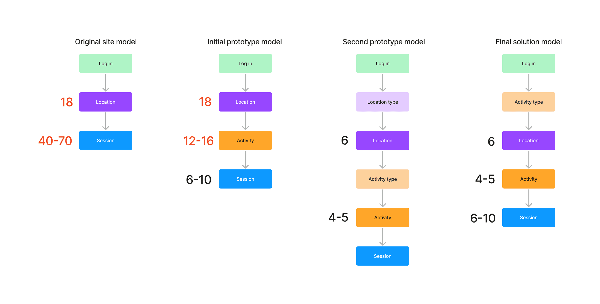
Let's see navigation problems of the original website. A user needs to choose 1 of 18 locations and then she sees 40-70 sessions for this location which are a lot of options to choose from.
Final solution has a small number of options for each level and a relatively short number of levels.
Original platform and research
I did an expert evaluation of the current platform.
In summary:
Short and advanced search widgets are difficult to use
Filters don’t work as expected
First-time users don’t understand what activities are available in each location
A lot of visual noise and distractions
The booking process is not optimised for different activities
After evaluation, I did usability testing with 3 users to see their workarounds for pain points. The follow-up interview showed that the users felt frustrated and reluctant to use the booking system, although they enjoyed the facilities and group exercises.
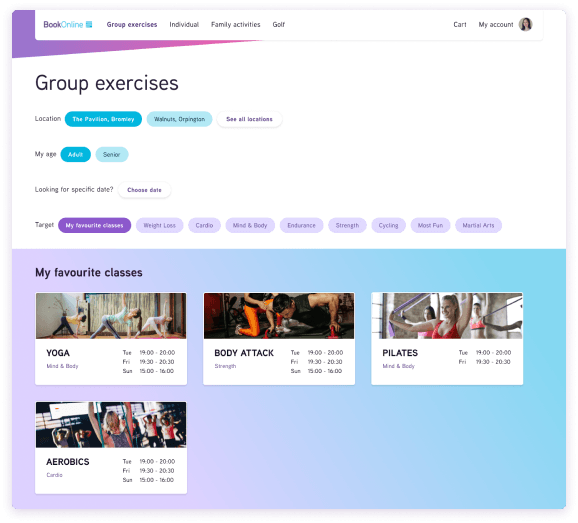
Navigation for classes
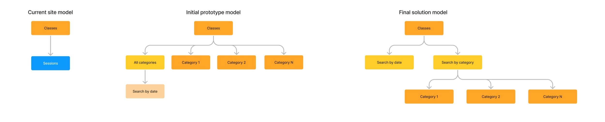
The current web platform shows all available sessions for all available classes (for example, for yoga or aerobics). Unlike other activities, classes are often searched by category (cardio, cycling, strength, etc) and by date, not just by date.
I found a model that supports effective search and navigation between the elements.
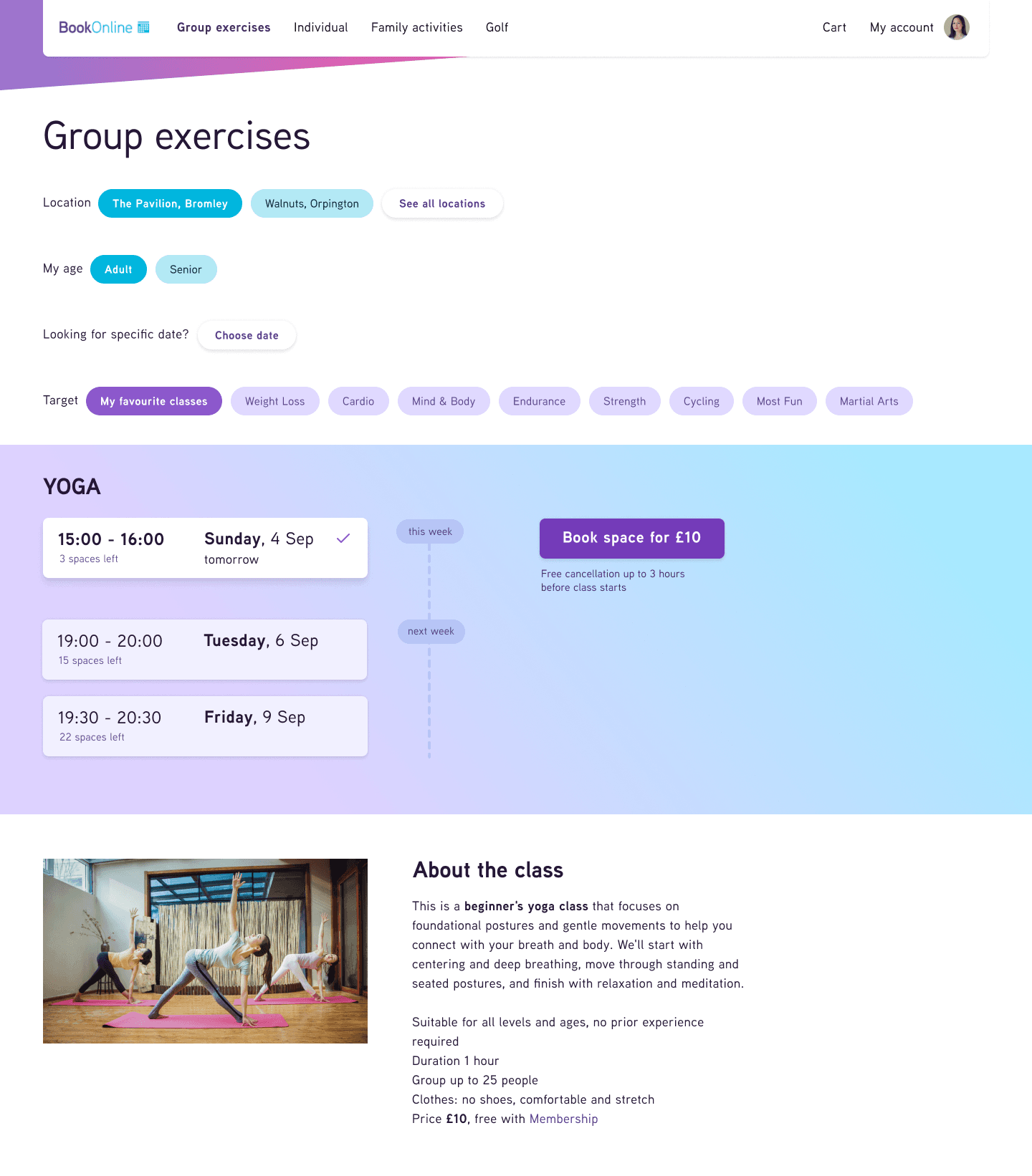
Final solution
After 3 rounds of prototypes, I came up with the solution that was effective for users.
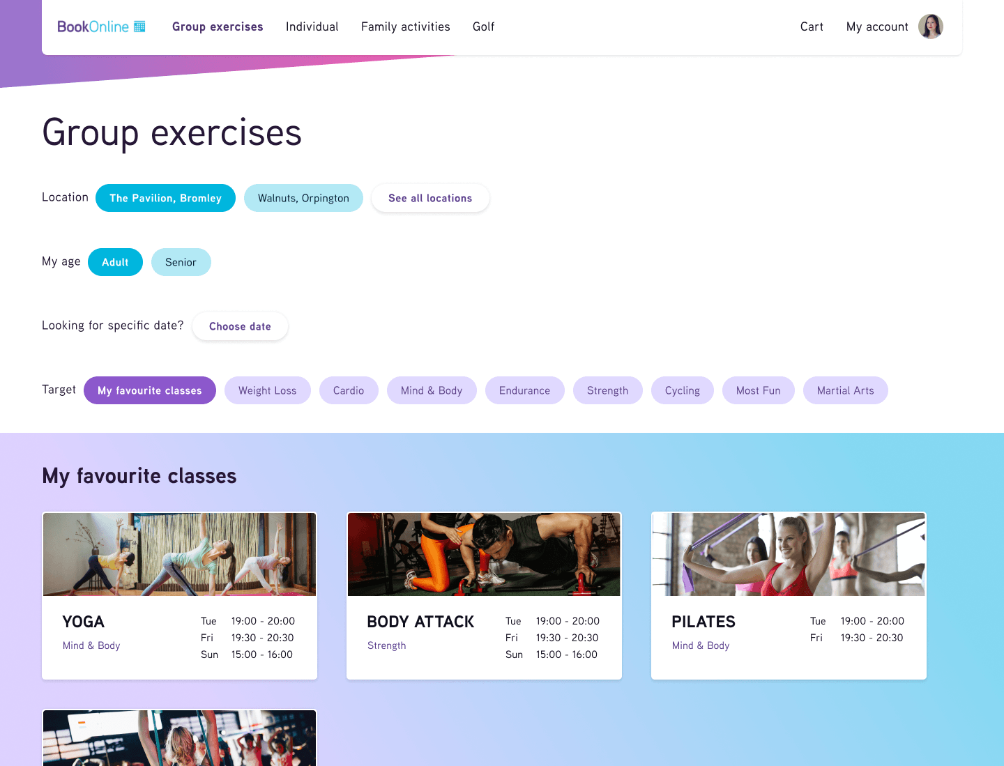
Tags are a better way to navigate than dropdown lists (as in the original design). User can search by category or by her favourite classes, which are the main options. Searching by date is available too.
Results
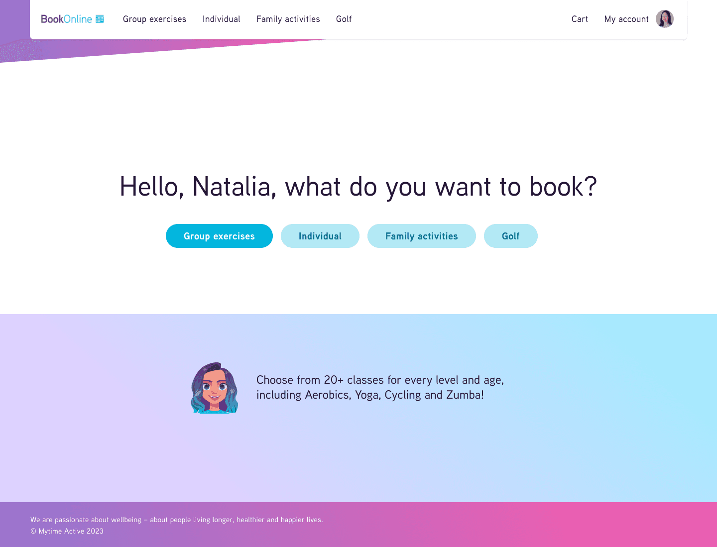
My solution provides an easy and effective way for booking different leisure and fitness activities. The system is intuitive for first-time users and is flexible for regular users.
The usability and user satisfaction are increased. The visual style of the booking platform reflects brands’ values and coordinates with the MyTimeActive marketing information website.
As business outcomes, I expect user growth, increased engagement and retention and fewer calls to the Support Centre.

